Knowing more about how people use our service
Read the Docs generates a lot of data.
We are the largest documentation platform out there,
with hundreds of thousands of projects using our product every day to host their documentation.
This data includes simple things like number of users,
builds using a particular Docker image,
as well as more interesting ones like pageviews or Python dependencies installed via a requirements.txt file.
We didn’t collect this data in a systemic way during the first 10 years of our existence.
Last year, with the growth of our product and the team, plus the CZI grant we received, we started asking ourselves some questions that we couldn’t answer with the data we had. We decided to start working on a project to collect relevant data to answer a large number of questions about how people use our service.
What data are we collecting?
As you may already know, Read the Docs has a strict privacy policy which we follow to ensure we are protecting the privacy of our users, authors and readers. It’s still worth mentioning that most of the data we collect is publicly available, or is generated by our own service.
The data generated by Read the Docs which we already had access to was mostly high-level about our database objects. A few examples would be:
project configuration (e.g. PR build enabled, default branch)
build metadata (e.g. number of builds, length of builds)
platform information (redirects, webhooks, search queries, pageviews)
With our new data collection project, we were able to collect a lot of new, interesting data. This new data allows us to answer a whole new set of questions, and is mainly related to the build process. The new information that we’re collecting includes:
OS and Python versions used to build the documentation
Python and Conda dependencies installed during a documentation build
Apt packages installed prior to building docs
The entire contents of the Read the Docs configuration file
This allows us to answer questions like:
“How many projects are using Sphinx v4.5.0 in their builds?”
“What are the most used Sphinx extensions?”
“How fast is the adoption of a new Sphinx version once it is released?”
Plotting it nicely
The EthicalAds team, who is building our privacy-first ad network, suggested using Metabase since they were already using it for a similar use case and they were happy with it. We connected our PostgreSQL replica database to it and started plotting this data to get some insights. We found awesome things we want to start sharing with all the documentation community, since we think it will useful not only for ourselves but also for package maintainers.
Sphinx extensions used in the last 15 days
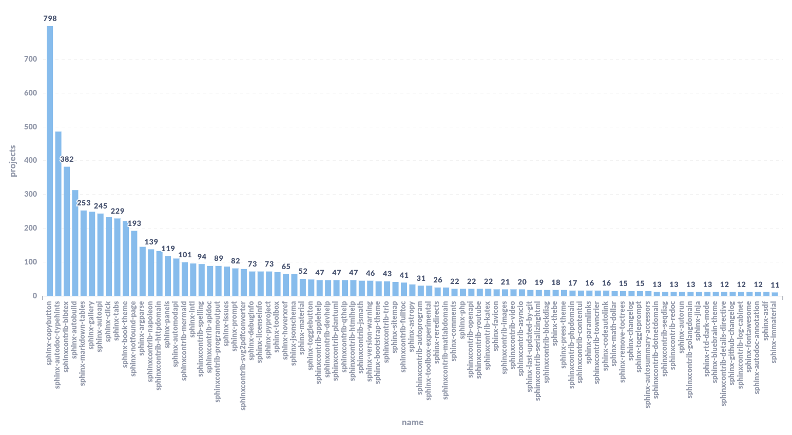
This plot helps us to understand the Sphinx ecosystem in general and to measure the adoption of our own extensions: sphinx-hoverxref and sphinx-notfound-page. We plan to share these results to the Sphinx maintainers, since this will be helpful on the conversation we are having about Removing JavaScript Dependencies.
Note
We excluded our own theme and Sphinx’s core depedencies because they are too high and break the relation with the others in the graph. Also, only extensions used by more than 10 projects are showed.
Sphinx adoption over time
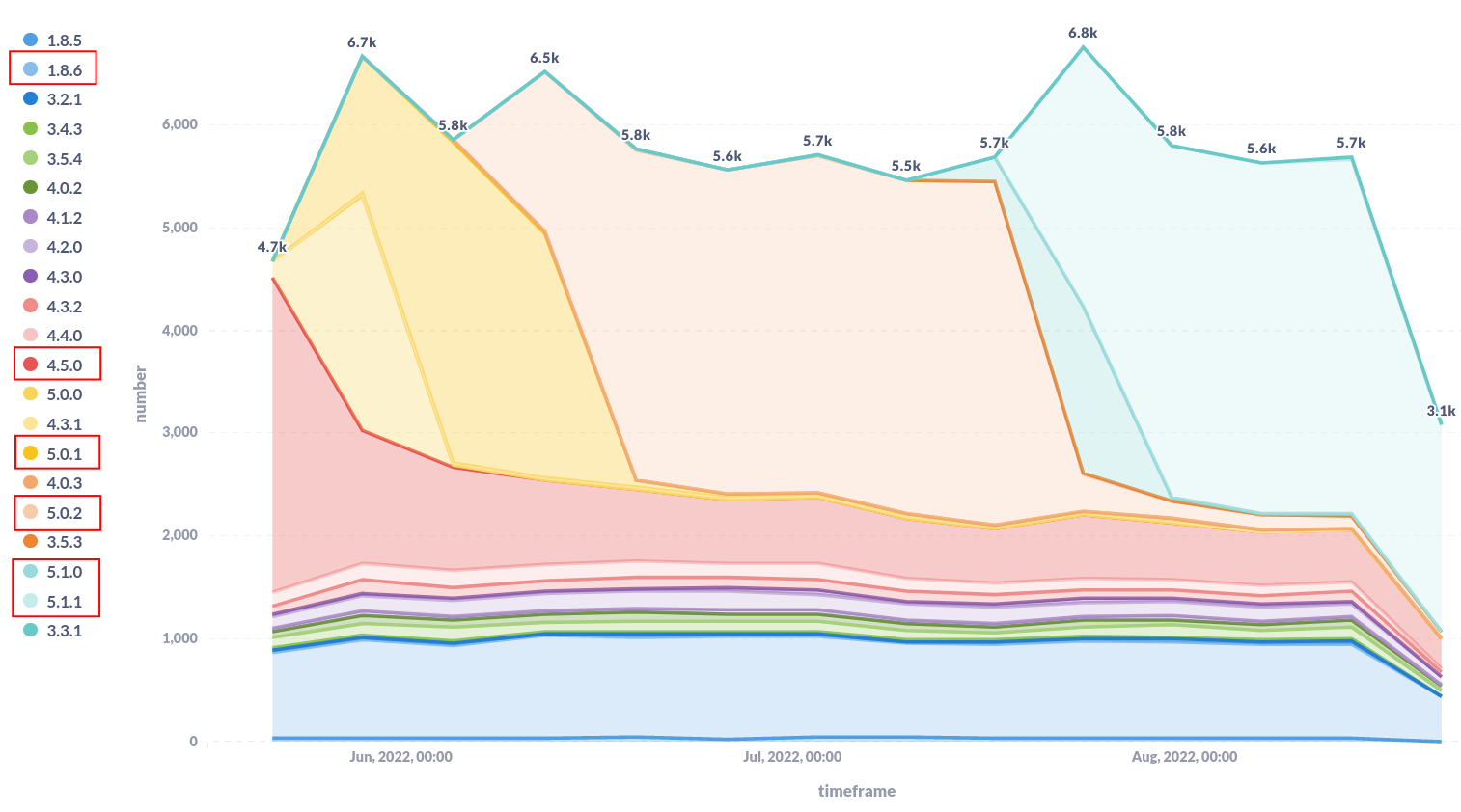
On this plot we can see that with each new release of Sphinx, the old versions decrease while the just released one increases. This is mainly because most of the projects are not pinning Sphinx and Read the Docs is installing the latest version by default. Note that versions marked with a red rectangle are the most relevant ones for this analysis, and are highlighted just to improve readability.
There is something that’s pretty prominent on this plot as well. The old version 1.8.6 has around 1000 projects, which could look suspicious at first sight. However, this is because Read the Docs still defaults to 1.8.6 on projects created before Oct 20, 2020. This is to keep compatibility with old projects and avoid breaking their builds without notification.
Projects using MyST to write Markdown in Sphinx
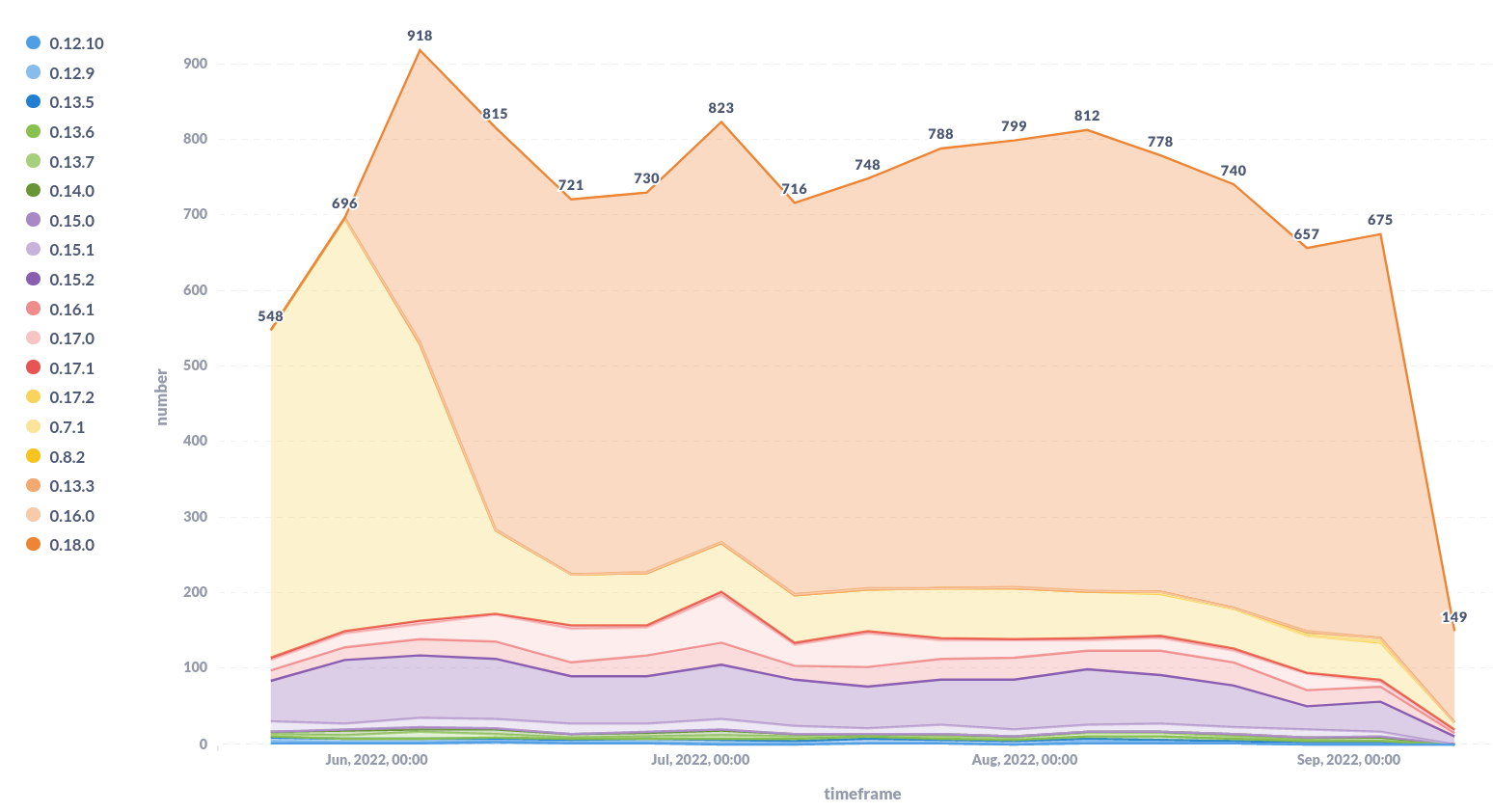
This is a similar plot than the previous one but for MyST parser. We are interested in knowing how many projects are writing Markdown using Sphinx. Many people don’t know it’s possible to write Markdown while keep using Sphinx and all the amazing features it has. Interestingly, the number of projects using MyST parser, currently, is higher than the number of projects using MkDocs. If you are reading this and you didn’t know about MyST parser, we strongly recommend you to give it a try!
VCS types used by projects with successful builds in last year
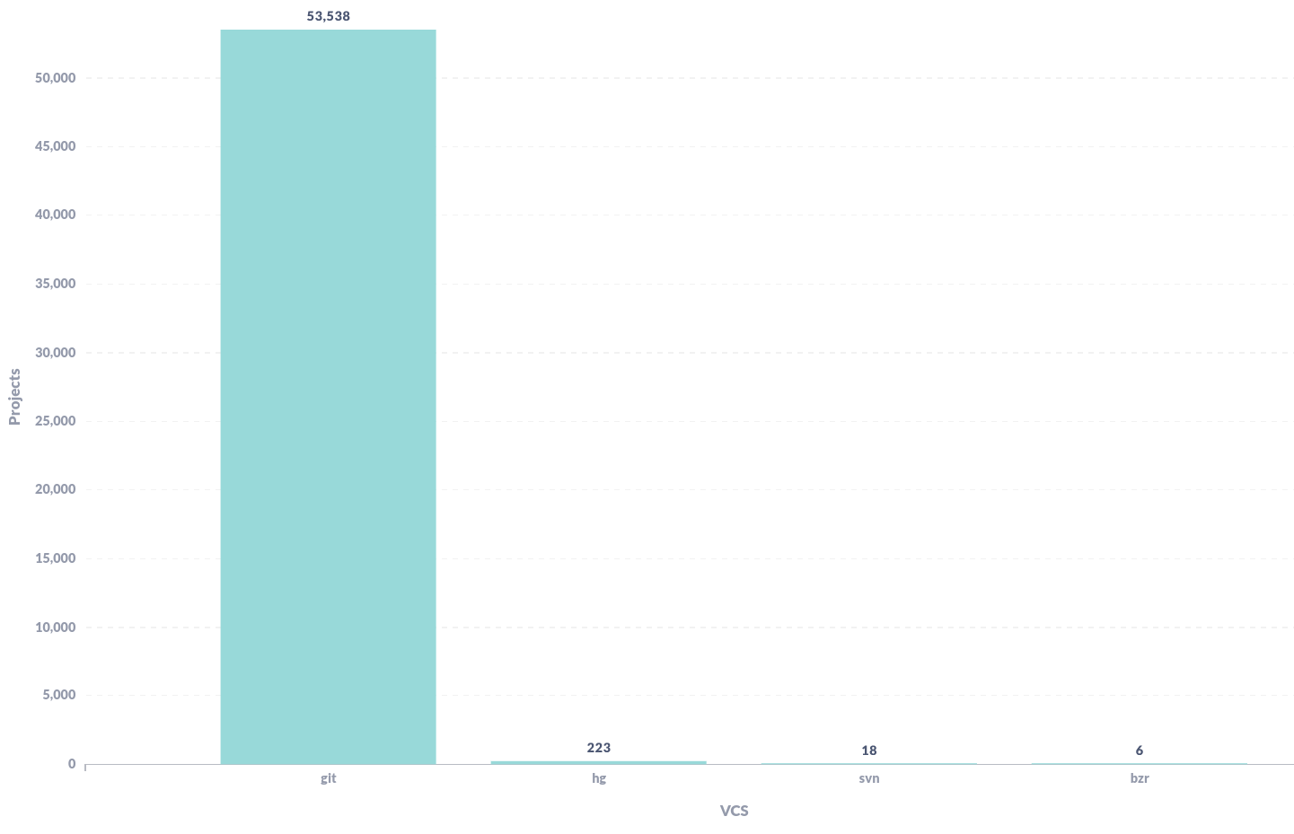
This simple plot helped us while discussing about start deprecating old VCS support. We can immediately notice that 99% of the projects with success builds in the last year are using Git as VCS.
Docker image used in the last 15 days
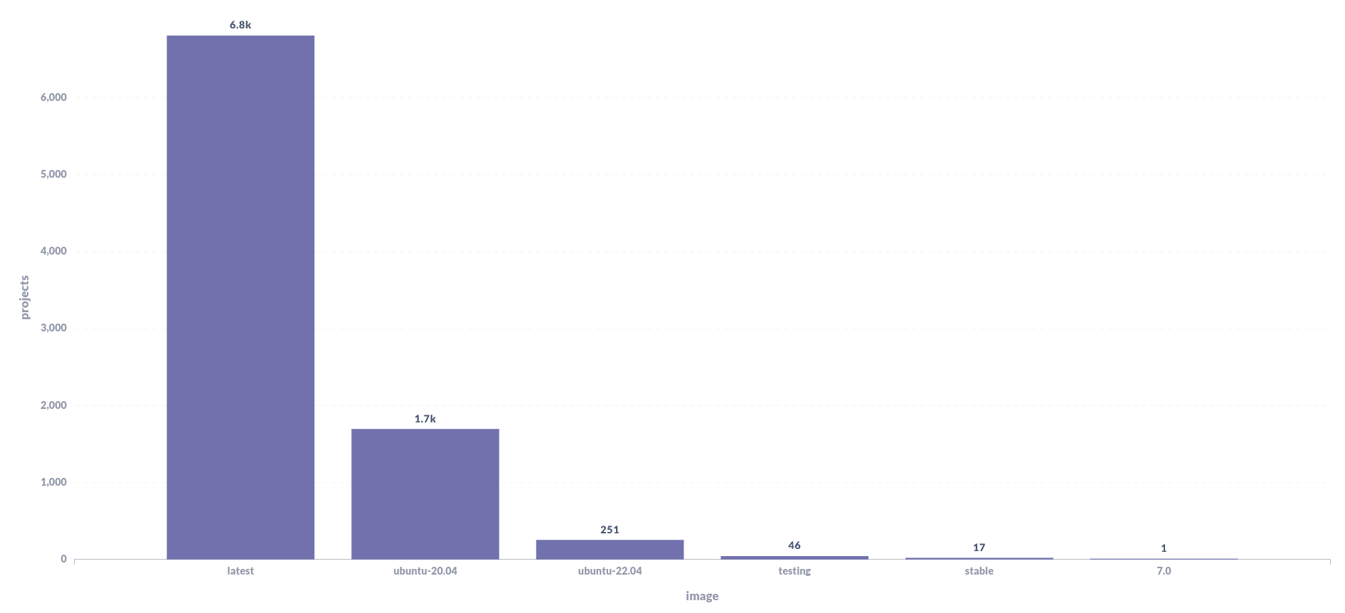
We had a similar deprecation discussion about the old Docker images that we still maintain. These images have been generating some issues lately due to the old packages installed on them, they make the UX more complex since users have more options to decide between, and also have some technical benefits while doing deploys.
With that context in mind and the insights we can get from this plot,
we could say that testing, stable and 7.0 could start being deprecated
and finally removed in the near future since they are not used by many projects.
Build time per project
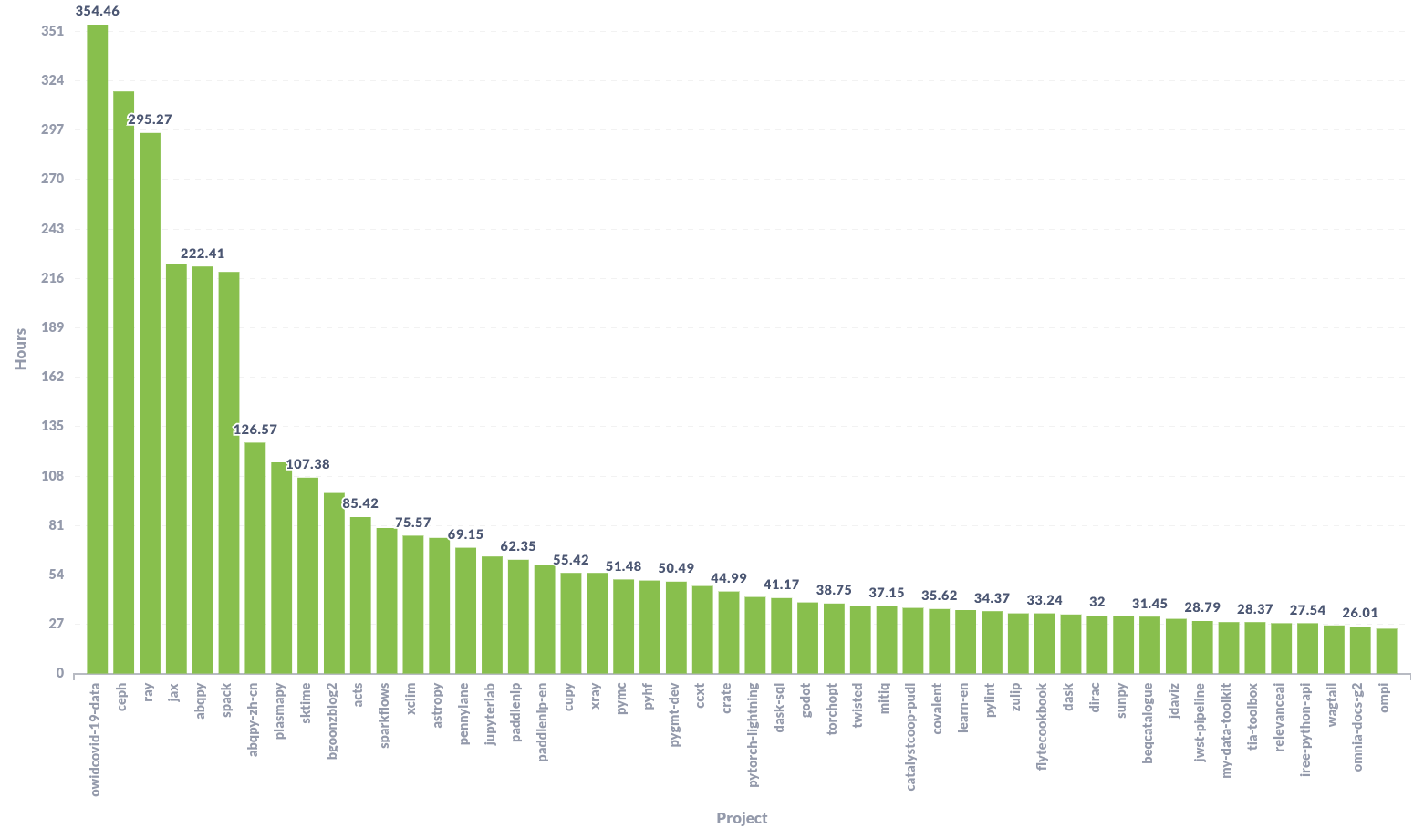
Thanks to this plot we were able to find some anomalies in our builds. We noticed that there were a few projects consuming 3x build time between different builds. This was due to the development workflow they follow (multiple pushes with small commits), making our platform to trigger multiple builds where each of them took more than 15 minutes to complete. This caused a bad UX, since they had to wait for all the old builds to finish before being able to see the results from the latest builds – which was the only valid one.
After noticing this happening pretty frequently to these projects, we prioritized the work on Cancel old builds, reducing the computing time for our servers and the waiting time for our users: Win-Win!
Analyzing the data
As you can see in the examples shown above, there are lot of insights that we can get from the data we’ve been collecting. We will use this information to make better decisions for our product with a strong focus on our users:
Know how much a feature is used
Prioritize work based on people’s usage of our features
Evaluate the impact of a feature marked to be deprecated
Detect platform abuse
Analyze marketing campaigns and documentation updates impact on feature adoption
Communicate relevant insights to other open source projects and organizations
There is a lot we can do with the data we have. We are still exploring and learning about the data, but we’ve already used this data to understand more about our product and how our users use it.
Conclusion
We are really happy with the data we were able to plot so far! At the moment, we only have data for the last ~6 months and it has been useful already. It has been very interesting to use these plots to make arguments when evaluating the deprecation of a feature, or even when suggesting a new UX in the discussions we’ve had recently.
Let us know if you would like to use this data in some fashion, or if there are any data or plots you are interested in so that we can query our database and share it with you and the community.
We will continue taking a look at this data in the following months. Try to find more insights that helps us to make better decision for our product and users. Subscribe to our newsletter so you don’t miss it!
- 13 September 2022
- Barcelona, Spain
Follow us
Recent Posts
- 10 January - Read the Docs newsletter - January 2024
- 03 January - New improvements to redirects
- 05 December - Read the Docs newsletter - December 2023
- 28 November - Introducing support for version-only projects
- 14 November - Security update on incoming webhooks from integrations